
Redesigning the Music Feature to Boost Engagement
Level SuperMind | UX Designer | Mobile App | Dec 2024 – Jan 2025
Redesigned the Music section to simplify navigation and improve content discovery. Introduced a vertical scroll, featured banner, and tag-based filtering that significantly increased user engagement.
Background
The Music section was one of the most underutilized parts of the app. Despite rich content, users weren’t engaging with it much—and when they did, they often dropped off without starting an activity.
“I didn’t even know this much music existed in the app.”
— User interview
The design wasn’t doing justice to the content. It felt static, restrictive, and hard to navigate on mobile.
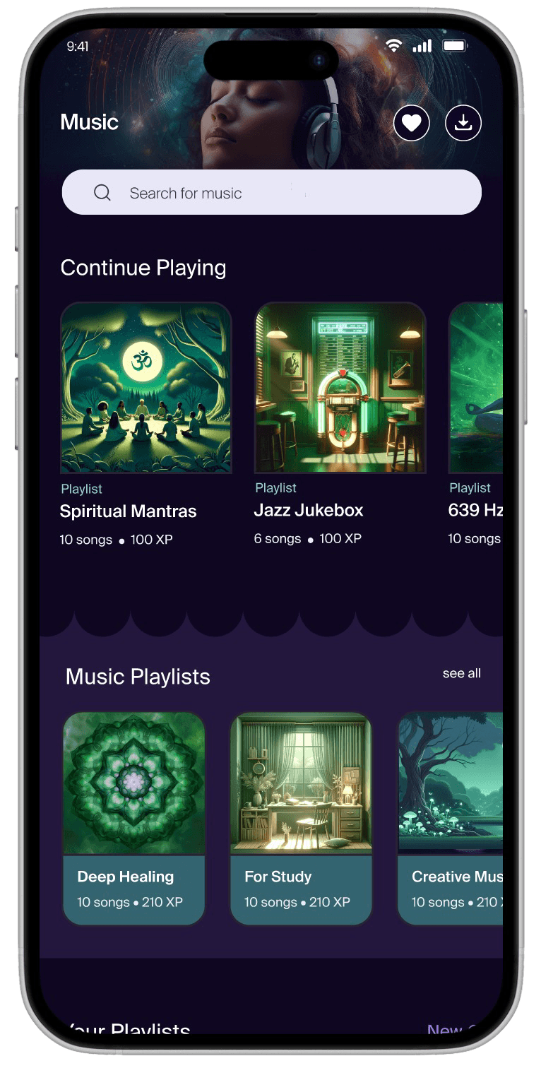
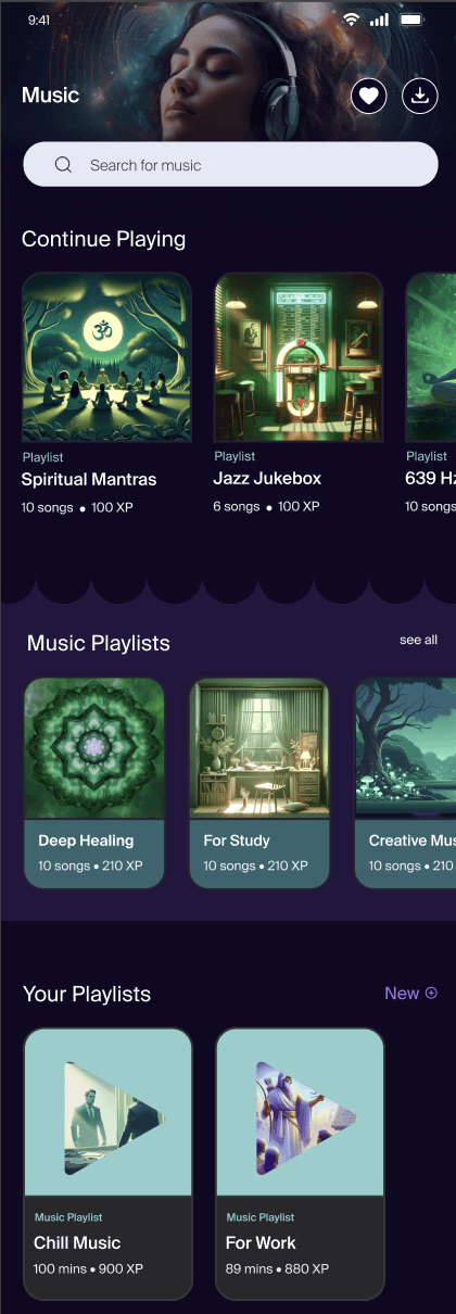
Screen 1
Screen after scroll
Image: Old Interface Design
🤔 The design seemed to be lacking a clear focus…
The page had just one playlist section with horizontal scroll and no personalization. New users had no idea what to play, and existing users had no quick way to return to what they liked.
So, I dug into user feedback and app analytics to see what was going wrong.
We discovered:
Most users dropped off within seconds of landing on the music page
Returning users often failed to find what they had played earlier
Free users had no clear way to discover what was accessible to them
🤯 To my surprise, many important UX principles had been overlooked...
Despite having good music, the structure was rigid, and the hierarchy didn’t guide exploration or re-engagement.
That’s when I decided to propose a bold shift in the experience structure, even if it meant deviating from the rest of the app’s layout.
Approach
Our goal was not just to “fix the page” but to test a new information architecture—one we could scale across the app if it proved successful.
I led the design direction while collaborating closely with a Jr UX Designer and Graphic Designer.
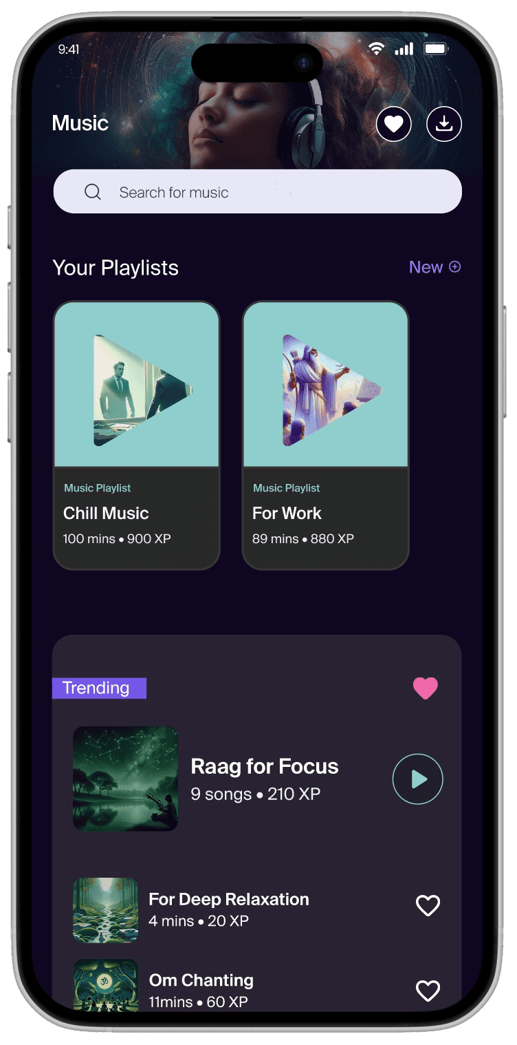
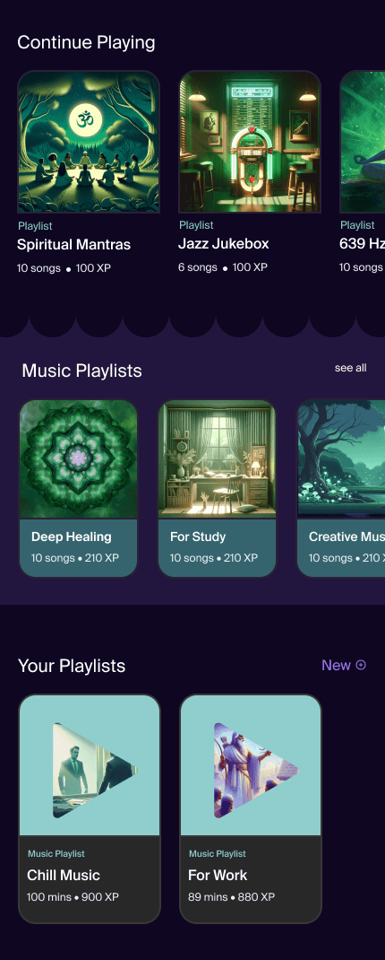
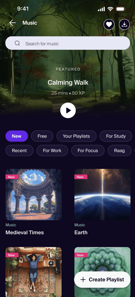
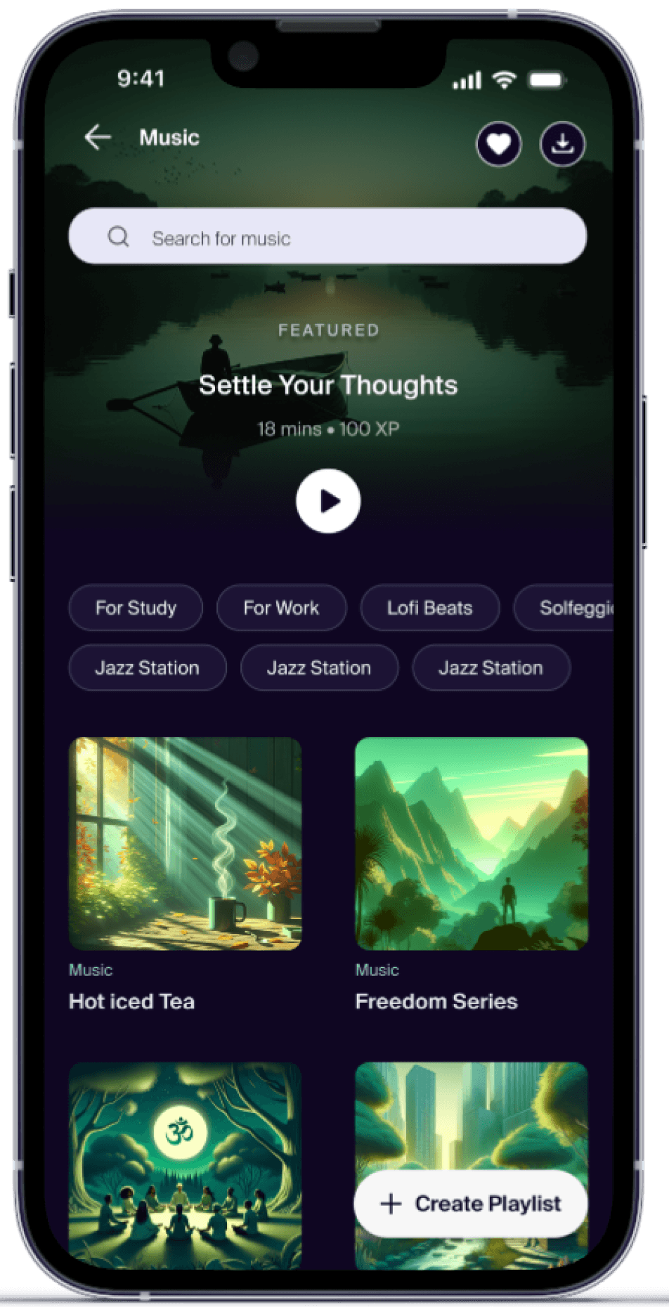
1. Switched to a Vertical Scroll Layout
Horizontal scroll limited visibility. Vertical scroll made browsing feel fluid and intuitive.
“Now I can actually see everything without swiping around blindly.”
— User during usability testing
Vertical Scroll
Horizontal Scroll
2. Introduced Curated Playlists with Tags
We moved from a random playlist view to multiple contextual tags view like Focus, Sleep and Calm as playlist name. This helped users browse by mood or intention very easily.
Returning users needed a quick way to replay music. By adding a simple Recents tag(continue playing in old design), we made it frictionless.
We also added a Free tag to help non-premium users easily discover content available to them—this clarity encouraged more exploration.

Image: Tag System
Banner for dynamic Suggestions
To guide first-time users, we added a top featured banner to suggest trending or personally relevant tracks.
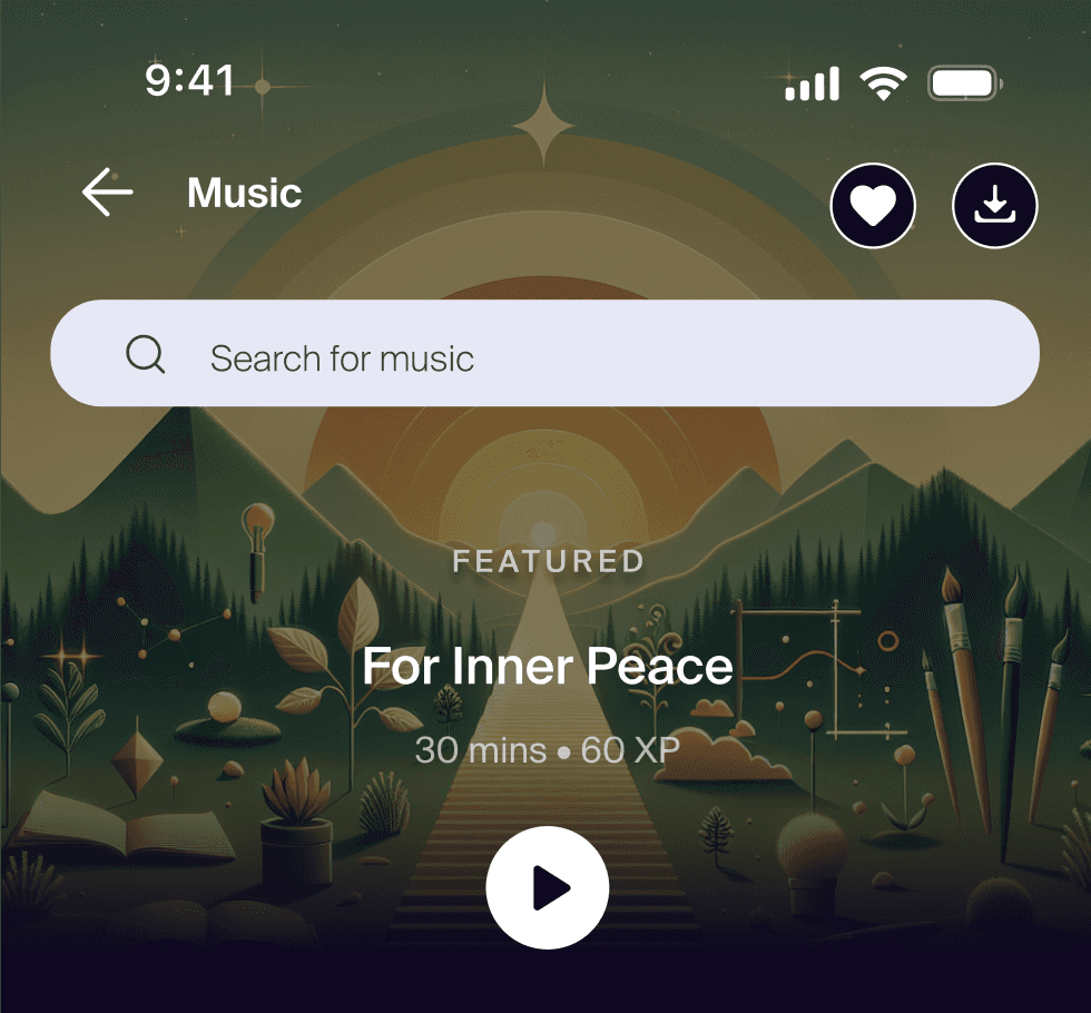
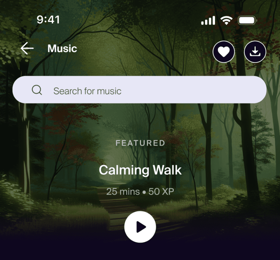
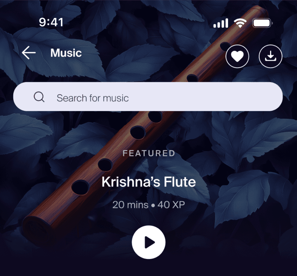
Image: Dynamic Card Design
3. Making it easy to create custom playlist
Playlist Option before
Playlist option Now
Outcomes
87%
reduction in music feature drop-off rate (from 38% to less than 5%)
Doubled
activities started per user per day (from 1.2 to 2.5)
💬 Internal teams called it “the most intuitive part of the app”
New Music Feature Design
Reflections
This project reminded me that UX is not just about screens—it’s about decisions. Reworking layout logic, adding small nudges like tags and banners, and respecting user context made a massive difference.
I’m proud that this redesign didn’t just solve a problem—it set a new design standard for the rest of the app.