
Transforming the Hippra Dashboard to Empower Healthcare Professionals
Nexus 8 International | UX Designer | Website | Mar 2024 – Apr 2024
In the journey to enhance user engagement for Hippra, a platform designed to revolutionize how healthcare professionals access and share clinical information, I led the UX Design team to rethink and redesign the user dashboard. This project aimed to make the dashboard more intuitive, personalized, and engaging, ultimately increasing user session time by 30%.
Background
Hippra is a platform designed to revolutionize healthcare information access, enabling professionals to collaborate, seek second opinions, and share their expertise seamlessly. I worked with the UX Design team to build the Hippra product from MVP and one of the main projects I worked on was rethinking and redesigning Hippra user dashboard page.
Hippra’s business problem
How might we empower healthcare professionals to improve their patient outcomes?
Importance of Hippra Dashboard
The Hippra dashboard is the user's first interaction point, linking them to crucial features and information.
Its design significantly impacts user engagement, trust, and overall experience, making it vital to capture user interest immediately and guide them efficiently through the platform. Despite its significant capabilities, it was yet to fully realize its potential.
The Problem
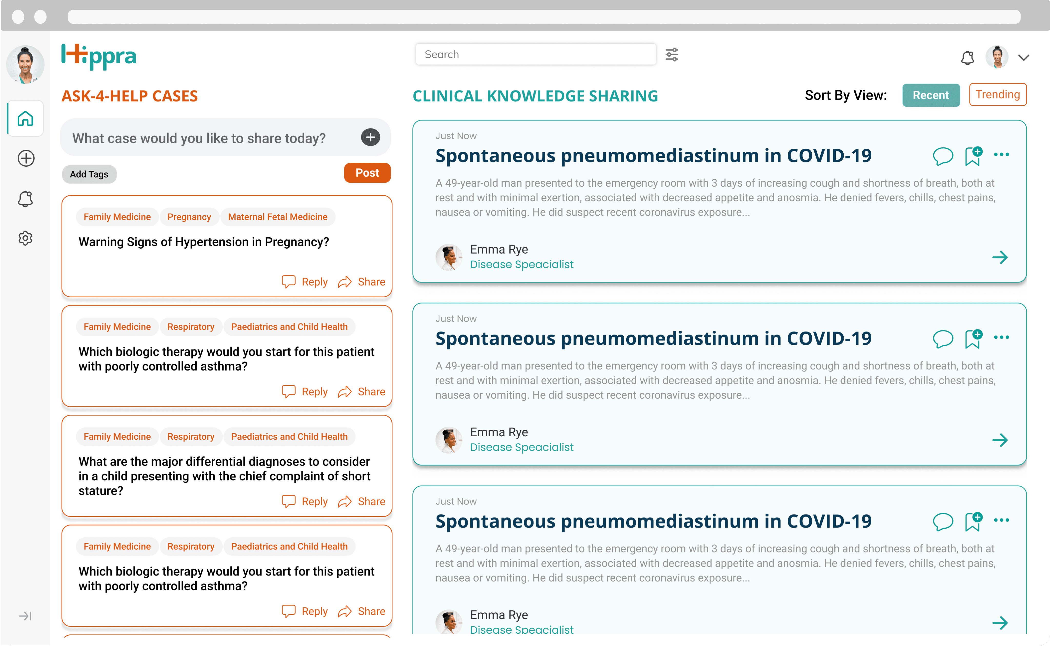
Image: Previous Dashboard Design
Low Usability of Hippra’s dashboard
Inconsistent Design: Inconsistent design and unclear functionalities reduced user trust.
Lack of Personalization: The generic dashboard presented an overwhelming amount of information, making it difficult for users to find relevant cases based on their specialty.
The Solution- A personalized and well-organized Hippra Dashboard!
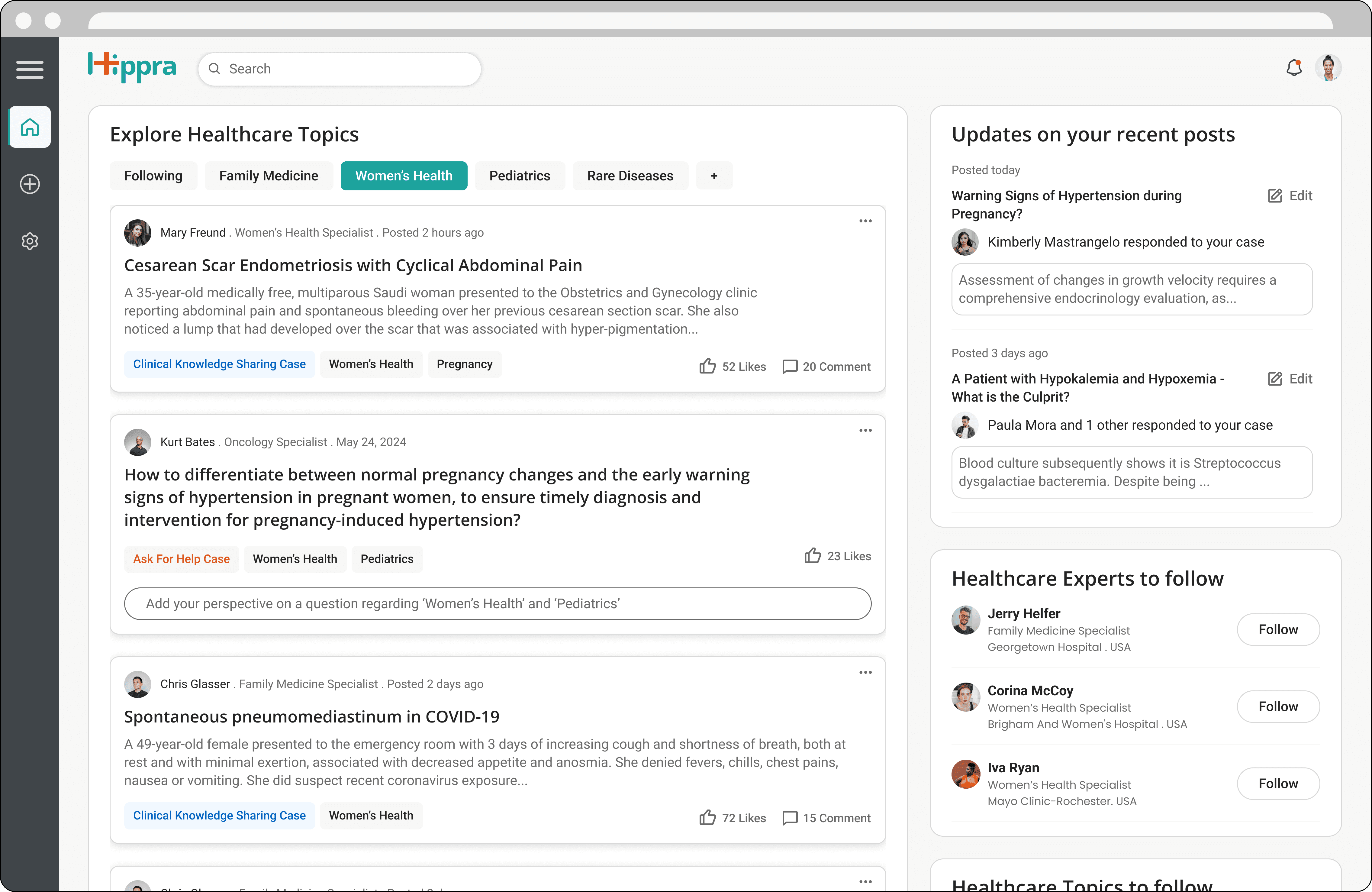
Image: New Dashboard Design
Simplifying Design: Created a consistent, intuitive, user-centered design to build trust.
Enhancing Personalization: Added personalized lists of topics and emphasized the "Following" feature to align content with user interests.
Outcomes
85
Achieved a SUS score of 85
30%
increase in user session time
“This is excellent! Everything our users need at a glance.”
— JANICE MC’CRE , HIPPRA’S CEO
However, finding the solution wasn’t a straightforward task...
Back story: Evaluating the Gaps between existing design and engineering team concerns.
As developers started implementing the designs created by previous employees, they raised concerns about design choices and development constraints. Several meetings with Hippra’s CEO and developers revealed key issues:
Developers not being included in design decisions
Unclear categorization of clinical cases into two types: A4H and CKS cases.
Inconsistent design for functionalities like reply, comment, save, share, tags and edit.
Ineffective sorting and trending case identification.
Misleading design of a component to post a new case because, in reality, users need to submit a long form with multiple fields to post a case.

Old Design
Modified Design
Removed the ‘post a case’ component as it was misleading and moved ‘save’ and ‘share’ functionalities for future changes due to their secondary importance
Brought consistency to the layout of both types of cases
To be able to sort posts based on trending, introduced the functionality of “Like” for a case
🤔 But the design seemed to be lacking a clear focus…
So, I went back to the books to find some clues regarding this from existing UX research findings and feedback received on the previous design.
🤯 To my surprise, many important findings from UX research had been neglected…
So, I decided to give redesigning the dashboard a shot
KICK-OFF: Organizing UX Research findings into user persona
I organized important findings from UX Research into a User Persona that can be referred to for driving design decisions:
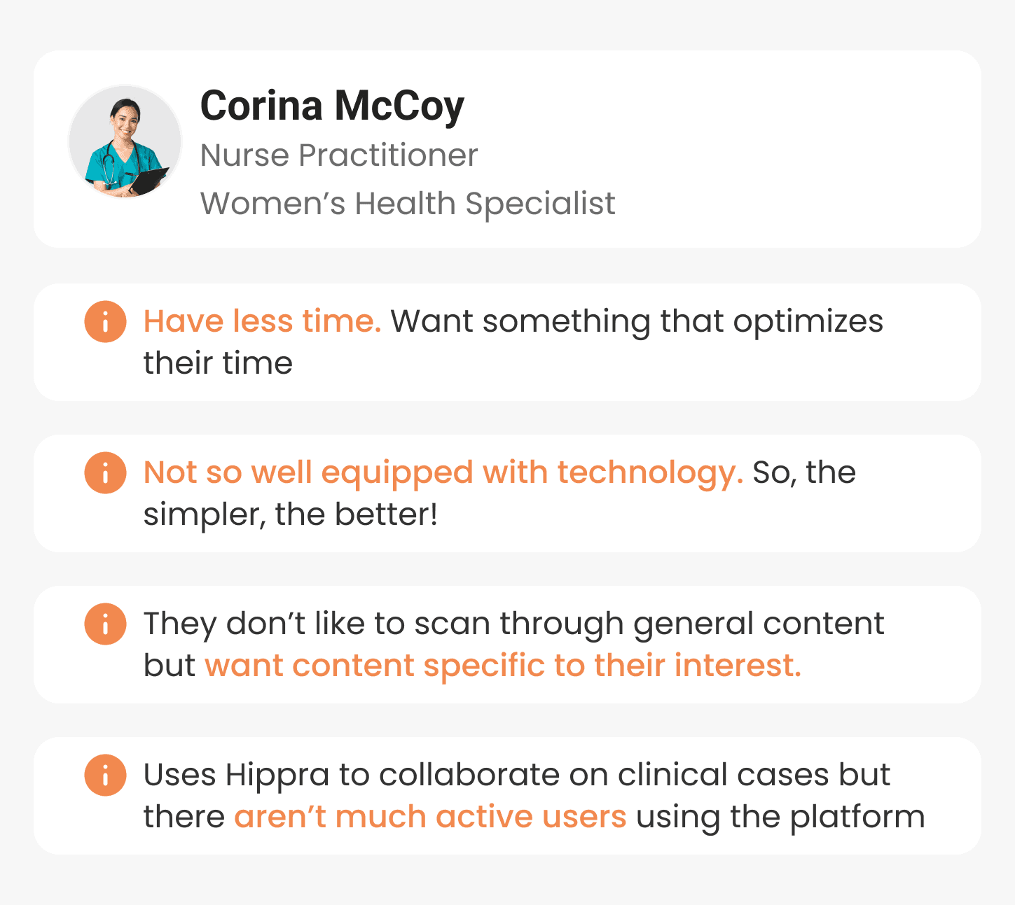
Image: User Persona
Key Insight #1: There was a necessity to ensure easy and quick access to personalised content
This generic list of cases was making it difficult for healthcare professionals with specific expertise like- Pediatrics, Women’s Health, and Psychology to find the content of their liking.
Key Insight #2: Users lacked the clarity and trust to various dashboard options!
- This design- though very new and colorful, had a learning curve with new headings, duplicate components, and undefined tags, making it difficult for users to understand.
- Moreover, it had inconsistencies in typography, iconography, colors, 5 different button styles, misleading functionality to post a case and more, reducing user’s trust in the product.
With this, I could clearly see the real problem in the dashboard design!
Defining the Problem Statement
How might we prioritize user needs of personalization and bring clarity to the Hippra dashboard?
Objective
Allow users to easily and quickly browse content as per their interests in a well-designed dashboard, thereby improving user engagement and business value.
Constraints
Time limit of a few days as developers were ready to implement the dashboard design
Convincing stakeholders to make these changes by advocating for users
With this, I could clearly see the real problem in the dashboard design!
My approach? Two strategic design decisions.
Design Decision 1: Taking explicit user input to personalize content
Due to very limited time, I decided to explore explicit user input ways to personalize content. If there had been more time and technical support, implementing an AI-based personalized experience would have been the best choice.
So, my objective was to allow users to view content of their interest by easily selecting through a list of options.
Idea: Showing filters at the top where users can explicitly choose their preferred content categories.
Initially, I decided to use the existing tags as filter options to personalise content quickly. However, this approach failed quickly because Tags were not predefined so, there were hundreds of random tags with similar meaning entries like ‘Clinical knowledge Case’, ‘knowledge sharing’ and ‘clinical_knowledge_sharing’.

So, I formed filter options by combining the following two ways:
1. Introducing new ‘Healthcare Topics’ as filter options
I introduced the idea of categorizing all cases into a broad list of healthcare categories like Pediatrics, Anesthesiology, and psychology.
I went ahead to design these healthcare topics as filter options and showed them at the top of the dashboard screen to streamline the browsing experience as per user interests.
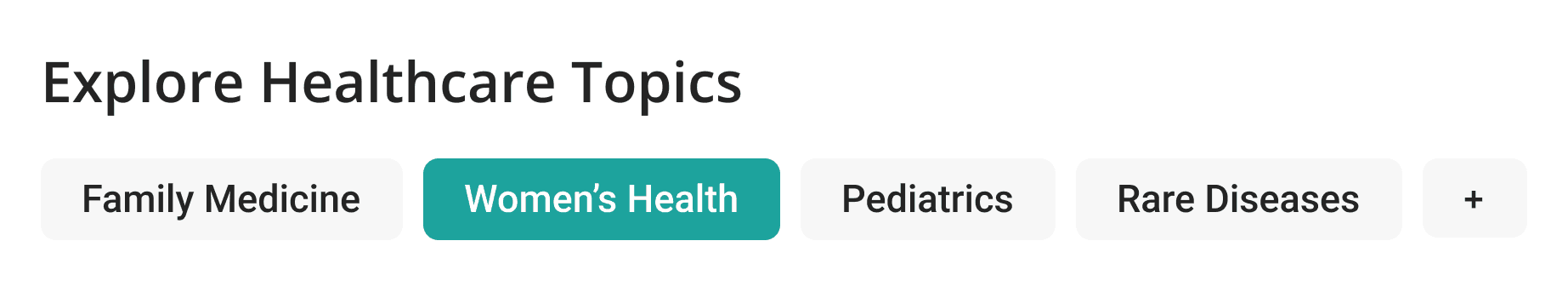
A feature that allows users to select any 5 topics of their interest from a broad list of healthcare topics to be saved as filters.
2. Bringing “Following” functionality to the limelight by adding it as one of the filter options at the start
Seeing the content by people the user is following at a click helped personalize the content feed!

‘Following’ is the first filter option to personalize the browsing experience
Intermediate Dashboard
Image: Intermediate dashboard screen with filters
🤔 Even though dashboard has personalized content now, it still seemed to be lacking focus…
That’s when I took design decision 2: Establishing a clear focus in dashboard design
My objective was to establish a clear visual hierarchy in the dashboard, with a focus on personalized content.
To decide on a dashboard page layout that establishes a clear focus, I implemented a three-step process:
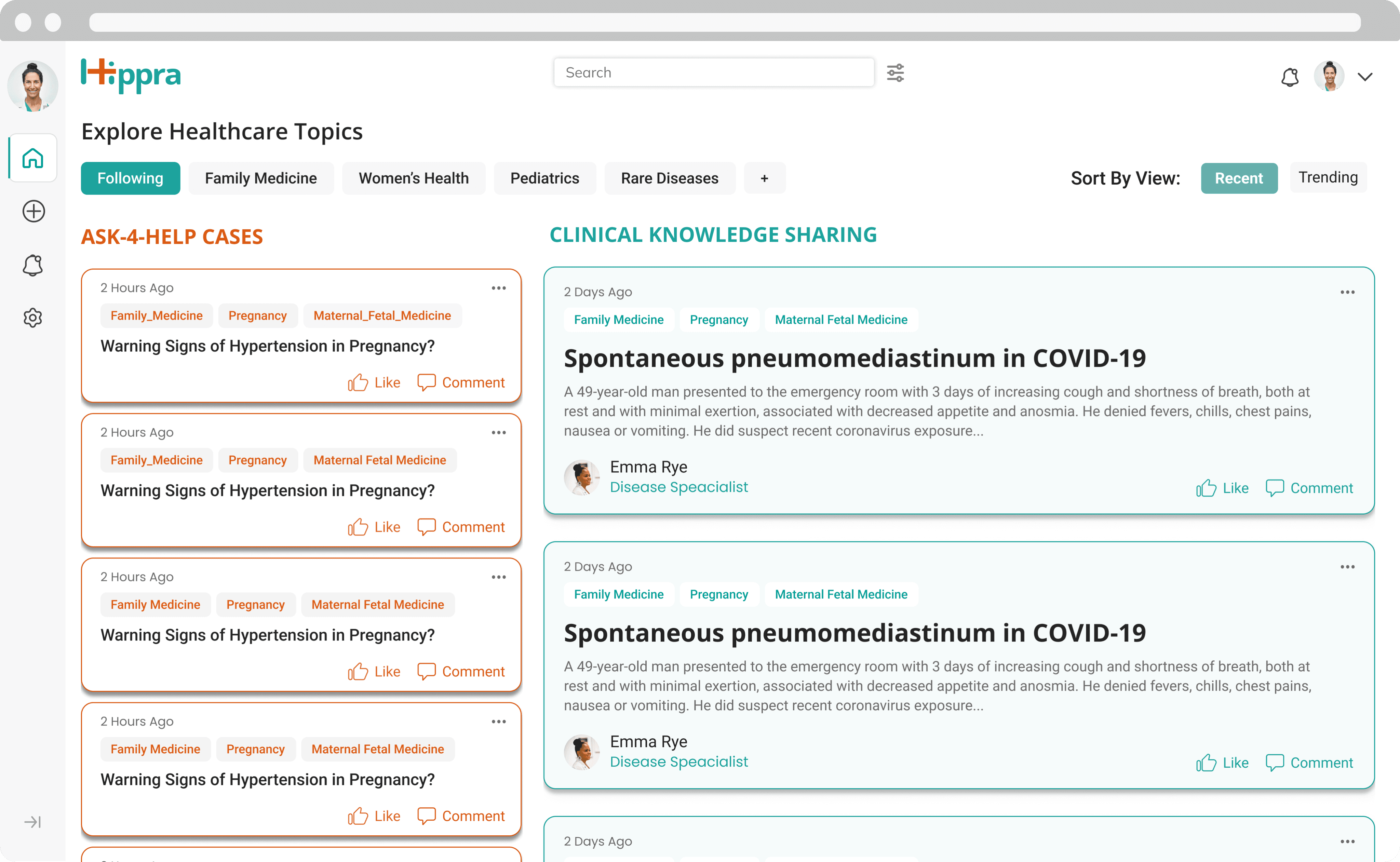
1. Merging both columns, bringing the primary focus to a singular column
Firstly, both columns seem to be competing for attention and hence, the dashboard didn’t have a clear focus. It also added the cognitive load of keeping track of two columns at the same time!
Merging two columns into one helped establish a clear focus on the dashboard.
To still distinguish between ‘CKS case’ and ‘A4H case’ cards after merging them into one column, I added a distinctive tag of ‘CKS case’ and ‘A4H case’ to each card.
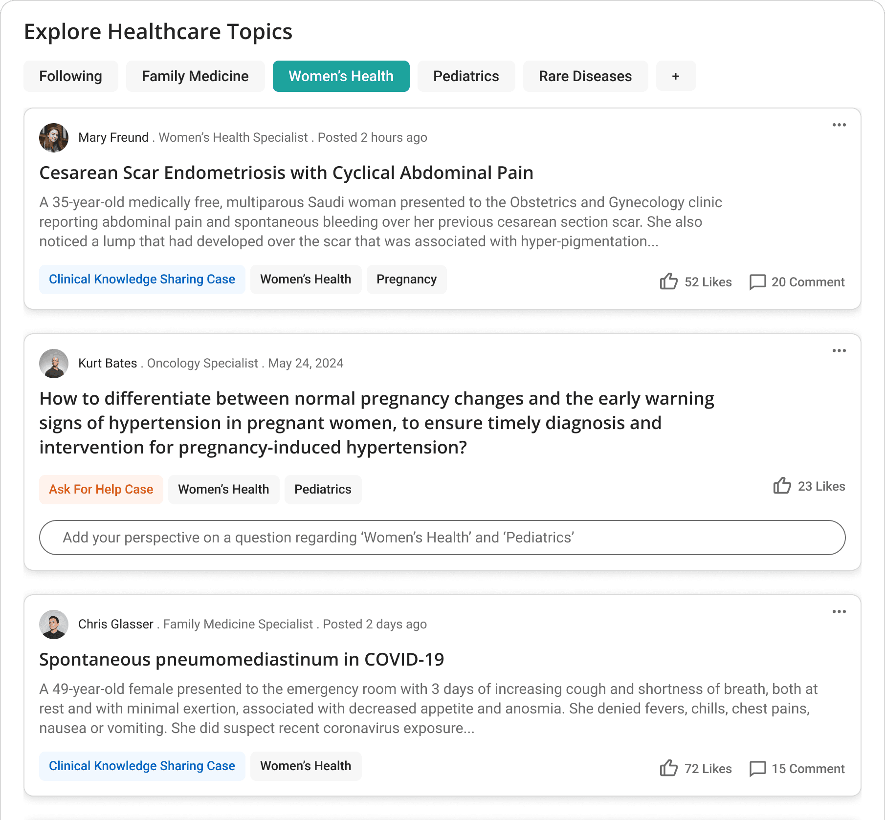
Image: Merged Columns
2. Suggested ‘healthcare experts to follow’ which adds to personalizing the dashboard feed

Image: Section to easily follow healthcare experts
3. Kept a secondary focus on ‘Updates on recent cases’ to save time for users
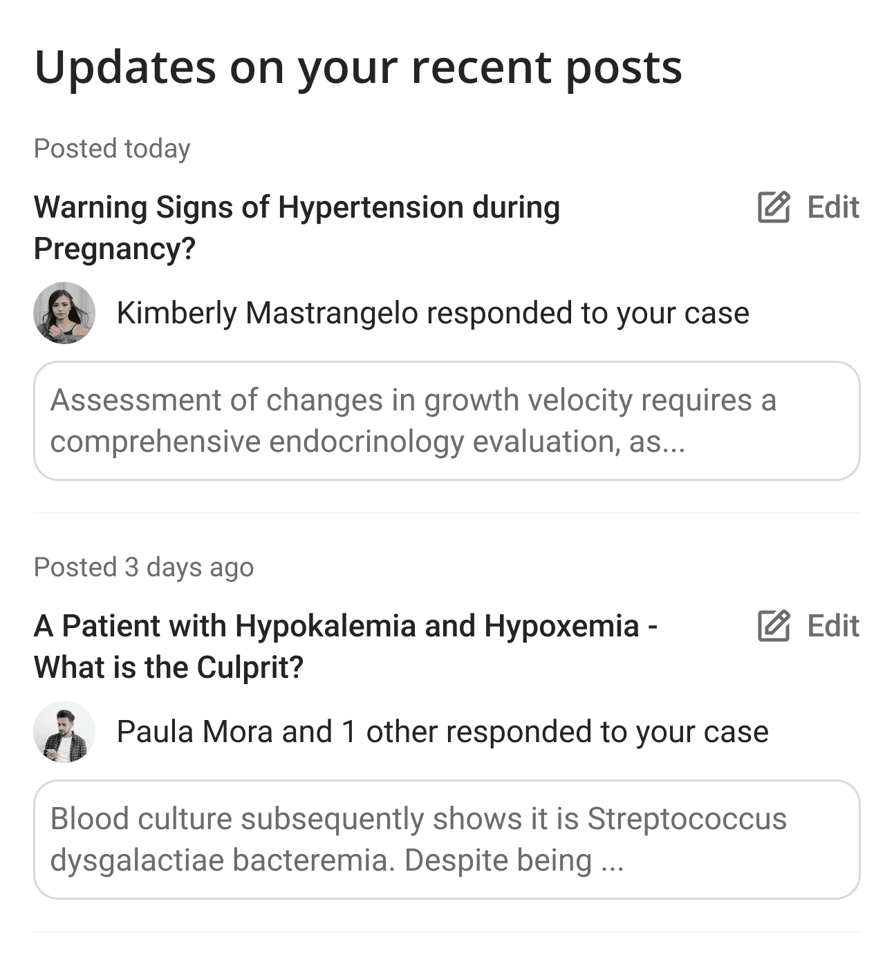
Image: Section to easily follow updates on recent posts
Final outcome? A new dashboard layout and color scheme that establishes a clear focus on all the important functionalities for users
Two columns that clearly establish visual hierarchy with the left column being the focus and the narrower right column offering secondary functionalities.
Kept a single green shade as a primary color to suit the brand identity and used it only to denote action items. Changed clinical knowledge sharing case color to a shade of blue.
Image: Final Design of Dashboard
“I can see how browsing using healthcare topics can be very useful for users.”
- STAKEHOLDER
“I agree this will be beneficial for users. I know this is additional work for me but still I like this better. We can go ahead with implementation.”
- Lead Developer
✨ Finally, the decision was made to go ahead with the redesigned Hippra dashboard 💥 🎉
Outcomes
85
Achieved a SUS score of 85
30%
increase in user session time
More importantly, users felt empowered to connect, collaborate, and share knowledge more effectively. This translates to better-informed healthcare decisions and potentially, improved patient outcomes.
Reflections
Successfully advocated for users while balancing developer, and stakeholder priorities, collaborating to build user-centered product.
Realized the needs of healthcare professionals up-close.
Understood the importance of strategic decision-making in the design process