
Reducing User Churn through Strategic UX Overhaul
Level SuperMind | UX Designer | Mobile App | Jan 2025 – Apr 2025
Led the end-to-end UX redesign of the Level SuperMind app to reduce churn among users. By rethinking the navigation, simplifying the visual system, and optimizing the Day-0 experience, I helped cut churn from 35% to under 6% within two months.
Challenge
The app had a consistently high churn rate of ~35% among users, which directly impacted revenue.
Key Observations:
Users found the app “overwhelming” and hard to navigate.
Content was difficult to rediscover.
Early user drop-off was high (~30% on Day-0).
Despite great content, the UX wasn’t supporting long-term engagement — a critical factor in wellness-based apps.
“I couldn’t find the meditation I did yesterday.”
“There’s too much going on. It’s not calming.”
— User Reviews
Research
To isolate design-related causes of churn, I initiated a multi-layered discovery process:
Synthesized feedback from 50+ user interviews with our CX team
Conducted heuristic audits and session recordings
Analyzed feature drop-off, navigation patterns, and retention cohorts
Insights
Cognitive load was too high due to visual and structural noise
Lack of content hierarchy led to disorientation
Day-0 experience showed everything, leaving new users confused
No clear CTA path or momentum-building strategy
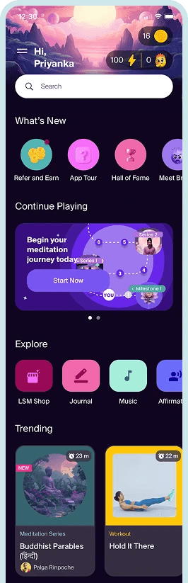
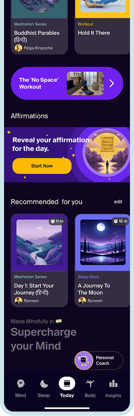
Image: Old Interface Design of the app
Strategy
I proposed a 3-part UX strategy, aligned with business goals and user psychology:
Goal 1: Reduce cognitive load
UX Strategy: Simplify design system & color usage
Business Value: Faster decision-making, lower exit rate
Goal 2: Improve content discoverability
UX Strategy: Redesign IA & navigation model
Business Value: Boost engagement & content consumption
Goal 3: Increase Day-0 retention
UX Strategy: Personalized onboarding & progressive reveal
Business Value: Convert new users into retained ones
1. Reducing cognitive load with Visual System Redesign
Reduced colors from 6 to a focused palette using primary purple only for CTAs
Introduced neutral backgrounds and removed distracting image strokes
Reduced decorative assets that didn’t support UX clarity
Ensured consistent UI across Android and iOS using platform guidelines
Result: Improved visual hierarchy, faster scanning, and cleaner task flows.
“It’s easier to know where to click now. Buttons stand out clearly.”
“The app has become very easy to browse. I like it better now.”
— Users during usability testing
New Visual Style
Old visual style
Image: Visual Design
2. Improving content discoverability with Information Architecture Overhaul
Ran open and closed card sorting exercises
Re-mapped app structure based on user goals and frequency of use
Grouped content into actionable, logical clusters
Supported both guided and self-driven exploration paths
Result:
Navigation depth reduced by 40%
Returning users found content 2x faster (measured via click tracking)
“The categories make sense now. I know exactly where to go.”
“It feels more organized. I’m discovering content I hadn’t noticed before.”
— Users in feedback
Optimised Information Architecture
Old Navigation
Image: Navigation Optimisation
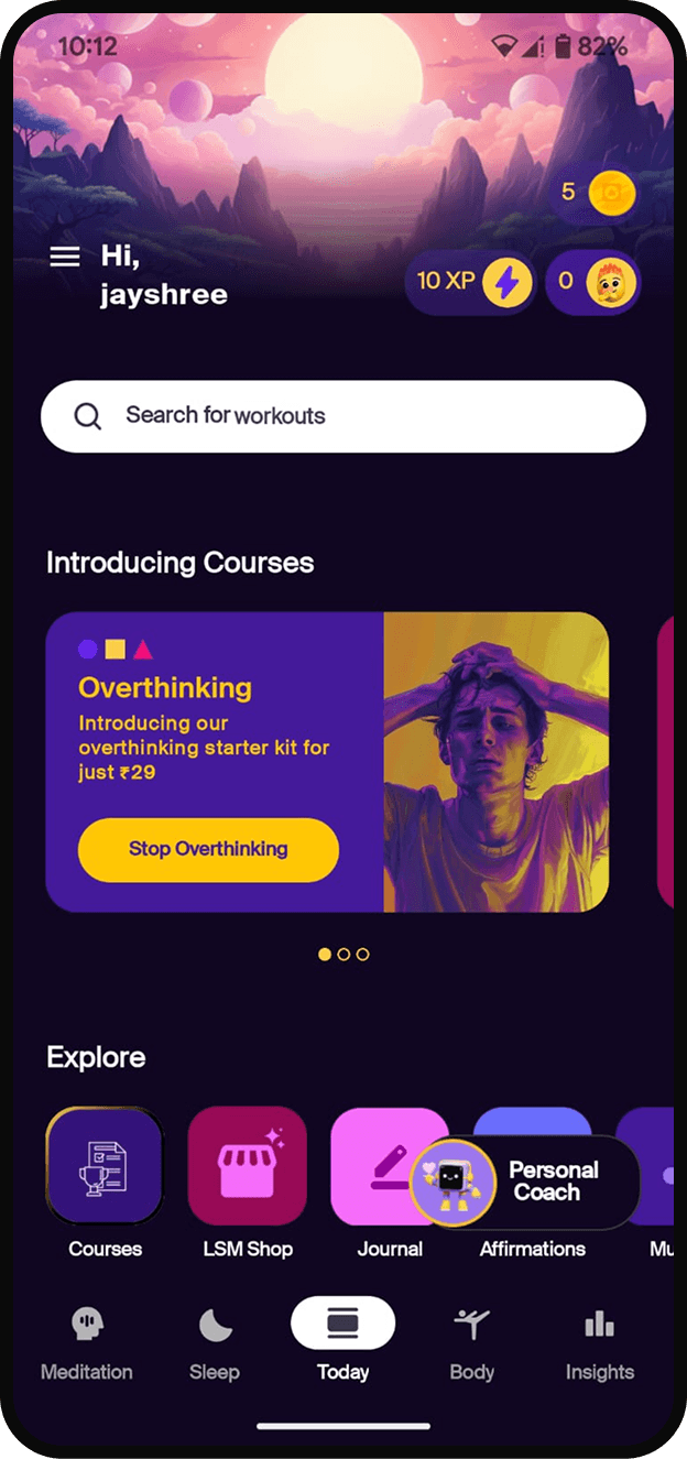
3. Day-0 Experience Optimization
Created a focused app experience that introduces 1–2 key journeys
Suppressed irrelevant features for new users (progressive disclosure)
Added first-time nudges based on entry intent (e.g., sleep vs anxiety)
“I knew exactly what to do and didn’t need to explore much.”
— Users during feedback calls
Image: Day 0 optimised journey of a non-premium user
Collaboration & Execution
Partnered with Product Manager, Jr UX Designer, and Visual Designer
Maintained a weekly stakeholder sync to align design with business metrics
Built a reusable design kit and visual framework for rapid future updates
Outcomes
80%
Reduced churn by over 80%, bringing it down from ~35% to under 6% through targeted UX.
<1%
UX issues reported through customer services
What This Showcases
Strategic Thinking: Framed churn as a design problem, crafted targeted UX strategy
System-Level Design: Refactored visual system and IA for scale
Collaboration & Influence: Led a cross-functional team and aligned stakeholders
Business Impact: Delivered measurable improvements to user and revenue metrics
Reflections
This project taught me the power of simplification as strategy — that great product design isn't just about delight but clarity, focus, and habit-building. The work laid the foundation for sustainable product growth, with design positioned at the core of business value.